who we are
about Maribe
Maribe is an architecture studio that believes good spaces begin with listening.
Every project begins with understanding the people who will live in it: their routines, needs, references, and the particular way they want to feel in that place.
Maribe was founded in Recife and, throughout its journey, has developed a sensitive and approachable way of seeing architecture.
Today, Maribe begins a new chapter under the direction of Nathalia Ribeiro, preserving its essence while building new paths, references, and possibilities.
More than a name, Maribe has become an identity.
leading Maribe
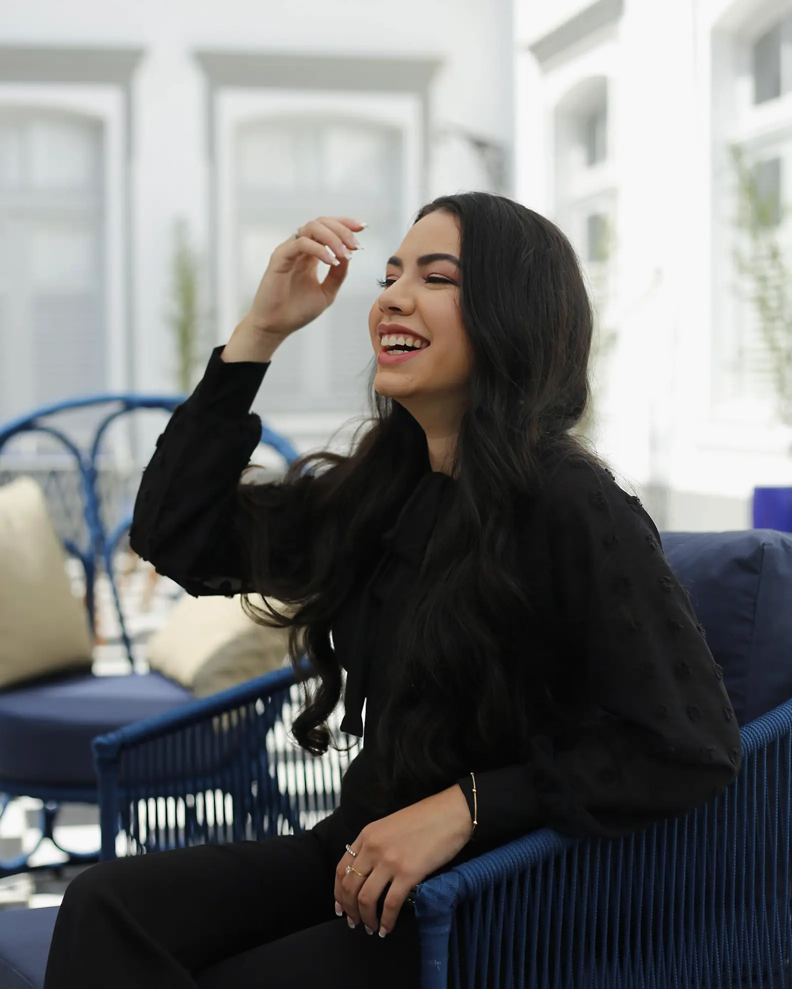
Nathalia Ribeiro
An architect and urban planner from UNICAP, Nathalia has a background in interior architecture, commercial projects, and graphic design.
Passionate about woodworking and practical, carefully detailed solutions, she sees design as an exercise in balancing aesthetics, functionality, and the way each person lives in their spaces.
Leading Maribe, she closely follows every stage of the process, transforming needs, references, and stories into spaces with personality and purpose.
our perspective
For us, architecture is not only about creating beautiful spaces.
It is about understanding routines, noticing details, and finding solutions that make sense for the people who live in each space.
We value projects with identity that do not sacrifice functionality; that are contemporary without becoming impersonal; and that can truly be lived in.
Every Maribe project begins with a different story — and that is precisely what makes each result unique.
our brand
Maribe's visual identity reflects what we believe in: architecture that welcomes, values stories, and connects with the place where it is born.
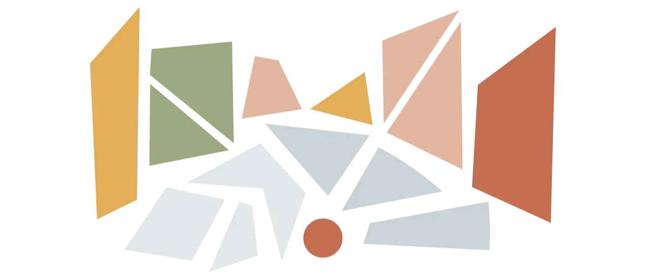
Our symbol brings together references to Recife's cultural strength, the sensitivity of Brazilian art, and the meeting of past and present.
The brand uses fragments of the Marco Zero design to form the landscape of Rua do Bom Jesus, one of the city's most emblematic streets. The blue shapes represent the cobblestones, while the colorful shapes represent the historic buildings. The red circle symbolizes Marco Zero itself, the point from which the streets expand and a reference to Recife's urban design.
The two shades of blue refer to the meeting of the Capibaribe and Beberibe rivers before they reach the sea. This union also represents Maribe's essence: the meeting of different references, stories, and ways of living — sea and river, saltwater and freshwater, memory and the new.
The mosaic composition draws inspiration from artists such as Hélio Oiticica and Tarsila do Amaral, and from the richness of Brazilian colors, forms, and references. The palette comes from Recife, while the rounded, organic typography reinforces softness, closeness, and a contemporary character.
The result is a brand that carries what we also seek in our projects: lightness, personality, and a beauty that welcomes.